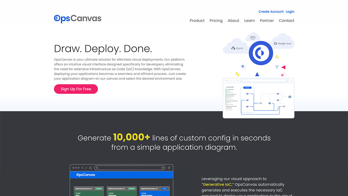

A highly visual brand for a blank cloud deployment canvas
OpsCanvas is an emerging technology startup that provides developers with an intuitive and efficient means to deploy applications to the cloud. Their interactive canvas allows for a no-code “draw and deploy” process that is highly customizable, allowing total team visibility into all of your application environments within a single pane of glass view. The startup sought Receptor to develop it’s visual identity, brand assets, and website.
Demonstrating simplicity while establishing extensibility
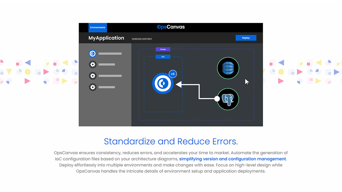
The OpsCanvas brand relies on the use of geometric shapes and primary colors to emphasize the ease of use of the product. The combination of colors, shapes, and patterns allows for a dynamic use of graphics and animations that showcase the plug-and-play nature of OpsCanvas’ interface. This approach works well in both light and dark-mode application to align with OpsCanvas’ developer-focused audience, portraying the company and its offerings in a concise and authentic way.
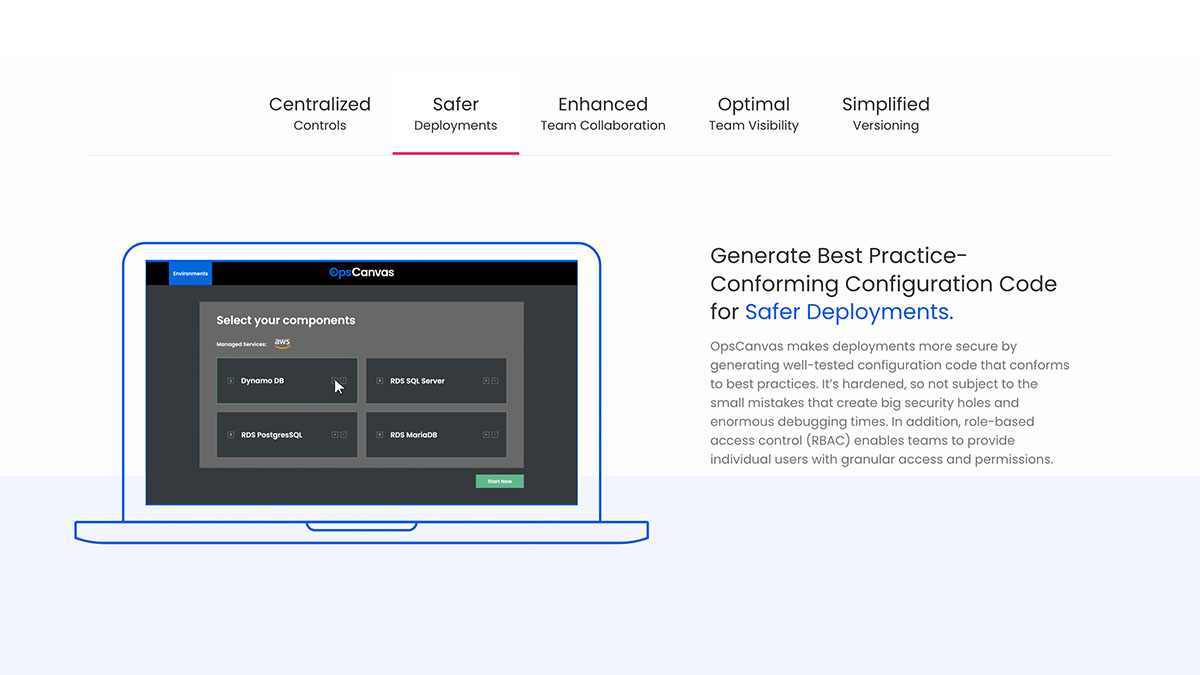
A custom WordPress website was developed to carry through the theme of flexibility through the use of numerous highly-customizable modules. A variety of animated videos were created for the website and for use in digital promotion to demonstrate the benefits of the product without relying on true screenshots or screen recordings. This enabled the startup to promote their quickly evolving product in a streamlined manner that quickly portrays its capabilities.
The results
After launching the company in October 2023, OpsCanvas is now poised to promote its mantra of simplifying cloud deployments to the developer community at large. With a full suite of brand materials, as well as a compelling brand identity that aligns with the purpose of the company and product, the sky is the limit for this startup.
