
Finding the elementary properties that make up a compelling brand
The Massachusetts Science & Engineering Fair (MSEF) is an organization that empowers students to learn about and pursue their passions in the science and engineering fields. In addition to their well-known science fairs, the organization works year round to promote opportunities for middle school and high school students around the state to learn and grow through their studies.
The organization contacted Receptor for assistance with the revitalization of their brand and website as it sought to bring in a fresher, more matured look that would entice students and educators to get involved.

Bridging the gap between students and educators
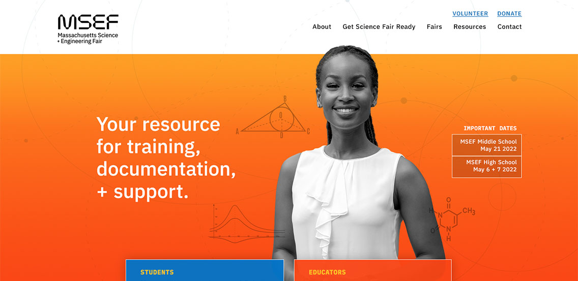
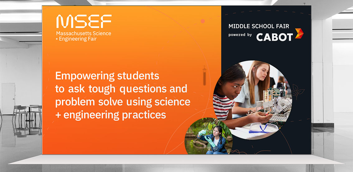
Receptor worked with MSEF to produce a brand that spoke to the scientific nature of it’s focus area in developing a logo that was inspired by space exploration. The linear icons and graphics used throughout the brand allude to scientific diagrams one might find in a textbook, as well as circular patterns evocative of planetary orbits and subatomic particles.
The brand carries through a focus of making children and educators look heroic in their representation across brand materials, empowering their target audiences to take action and get involved. The chosen color palette speaks to common color associations for both science and engineering fields.
The results
The renewed MSEF brand brings a more professional source of energy to their promotional efforts, while remaining grounded as a student-focused non-profit. MSEF continues to empower children to ask questions and try new things as they investigate a future in STEM learning.